
WHO, Covid-19 Report Design
Overview
Turning a global health response into a story people can see at a glance.
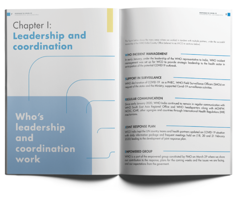
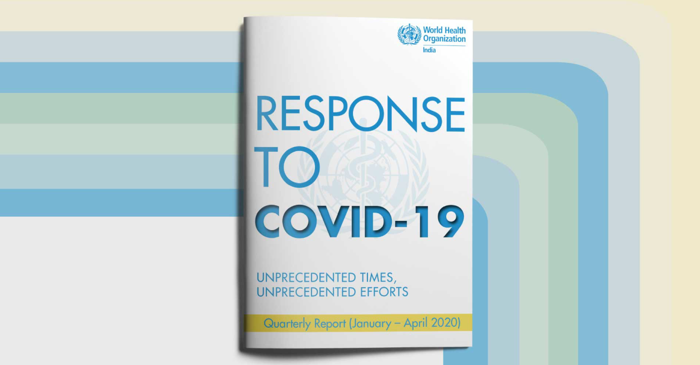
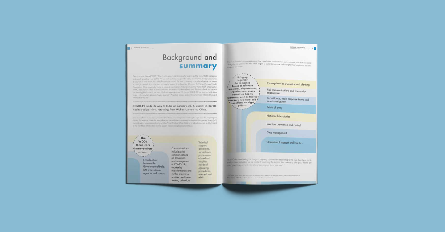
When the World Health Organization needed to communicate the scale of its Covid-19 response, the challenge was not a shortage of data but an overwhelming amount of it. We were tasked with the report design: taking dense pandemic figures, spanning the largest global health mobilisation in history, and shaping them into a clear, compelling document. Our work covered the full design scope, from editorial layout and visual hierarchy to custom data visualisation and infographics, transforming statistics like billions of vaccine doses delivered and billions spent on essential supplies into visuals a reader can absorb in moments rather than pages.
Strategic Objectives
Own the full report design end to end, from editorial layout and typography to custom charts and infographics, giving WHO a single polished, print-ready document.
Distil complex Covid-19 mobilisation data, partners, funding, vaccine delivery, and reach, into a concise report any reader can grasp at a glance.
Design a clear visual hierarchy and data-visualisation system that turns dense numbers into intuitive charts, so the scale of the response is felt, not just read.
Hold a sleek, modern, on-brand visual language throughout, balancing the credibility of a global health body with genuine readability.